Using landing page data to iterate on the product itself, not just the page around it.
The Problem Statement
- PR gifting is not treated like a transaction because it is not one. Brands send products hoping for coverage, creators post when they feel like it, and the whole model runs on goodwill.
- Creatorshop starts from a different premise: content is currency. Creators should be able to choose what they want and pay with a post. Brands should get coverage from creators who actually chose their product.
- The challenge was turning that idea into a landing page that could attract both sides of a two-sided marketplace before the marketplace existed.
The First Site
I built the initial landing page as a basic Tailwind waitlist site with a connected form, simple and functional, and it did its job of getting the product in front of people. But it surfaced a problem immediately: the ICP wasn't clearly defined. The creator industry is vast, from cooking to fashion to tech, and trying to speak to all of it meant speaking clearly to none of it. It also surfaced a product problem, since the barter model would look completely different for physical goods versus services versus software. The surface area was too large for a one-person team.
The Pivot: Landing Page Data Informed Product Design
Based on what the waitlist site surfaced, I adapted the product. The barter model served well as contextual to software as the first market: in the age of abundant code, distribution becomes the bottleneck, and the barter model could be especially powerful for software teams where product access is cheaper than traditional physical PR and gifting. Niching down to software specifically made sense on every level. It's delivered remotely with no fulfilment overhead, it costs less to give away, and it maps well to the current wave of AI and vibe-coded tools looking for distribution. A solo founder can actually serve this market.
The Second Waitlist Site
I built a second waitlist site to reflect the new direction, built off quick identity explorations I'd already been working on. The brand side responded well to the landing page. But feedback from creators was still coming in.
Creator Feedback
The feedback split into two threads. For some creators the message felt lost, they needed more context to understand what Creatorshop was offering them. For others the issue was the identity design: 'This is nice, but it feels very corporate.' I agreed. It felt like a classic SaaS design, but the startup has a bold proposition in the attention economy, the idea that digital content could be a financial primitive. Unlike the NFT wave before it, this model has real utility, and I wanted to reflect that disruptive spirit in the design.
The Final Two Landing Pages: The Craft of Information Architecture
The first decision was to emphasise clarity on an idea as dense as 'social content as a new financial primitive.' Splitting into two dedicated landing pages, one for each side of the marketplace, meant the language didn't get diluted across the site, avoiding confusion and sharpening the message for each audience. The pages mirror each other structurally but subvert each other tonally, tailored to context.
The Header: Between Maximalist Chaos and Minimalist Restraint
I had a lot of fun working on these two headers. I wanted them to exist between maximalist chaos and minimalist restraint. Metal animation and shaders are a favourite design trend of mine, so that's what I went with as the central UI direction for the brand page. But I didn't want the card animated there, since there were already so many animated elements at play; the restraint was intentional. For the creator landing page I wanted a more fun energy, even more subversive and playful. Because the context was creators, I was deeply inspired by the history of cellphones and UI design from previous eras, hence the pixel trail and the ASCII art. The scribbles felt like they directly subverted the 'this feels too corporate' feedback, bringing a playfulness that's almost synonymous with youth culture.
How it Works
Three steps, three metal objects: a floppy disk to browse the drop, a bag to apply to shop, and a key to pay with a post. The metal treatment carries the shimmer from the header into the page body, so the mechanic reads as an extension of the same material language rather than a separate illustration style. On the brand side, the same three-step structure uses the same metal icons with a more restrained treatment: grey cards, no colour, and a walkthrough of listing a campaign, reviewing pitches, and paying in access instead of cash.
Bringing the Product to the Landing Page
The brand side allows visitors to engage with the core creator-management mechanic right inside the landing page before signing up. The swipe feature gives brands a feel for the inbound creator-management experience before they commit.
UX Writing: The Soul of a Brand, in Text
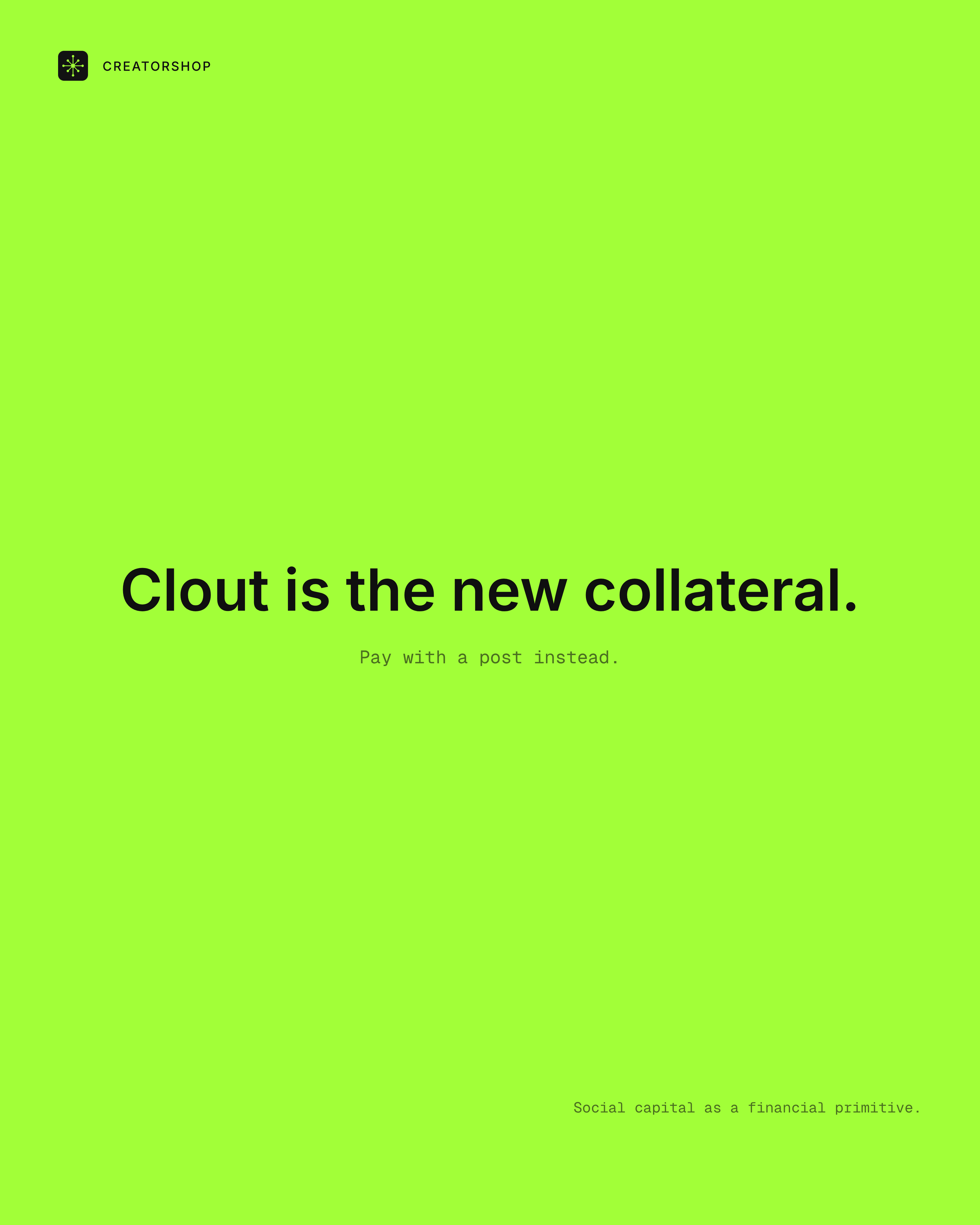
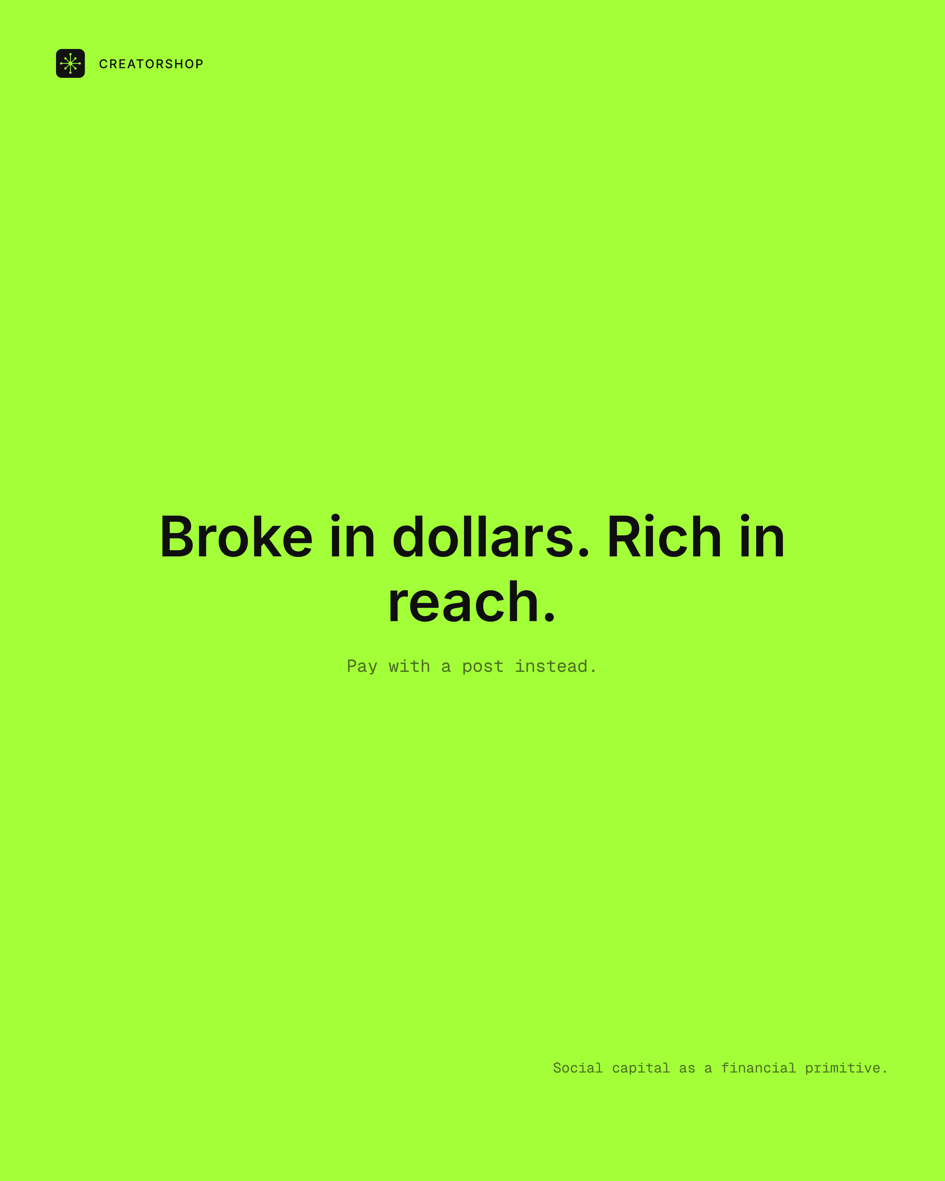
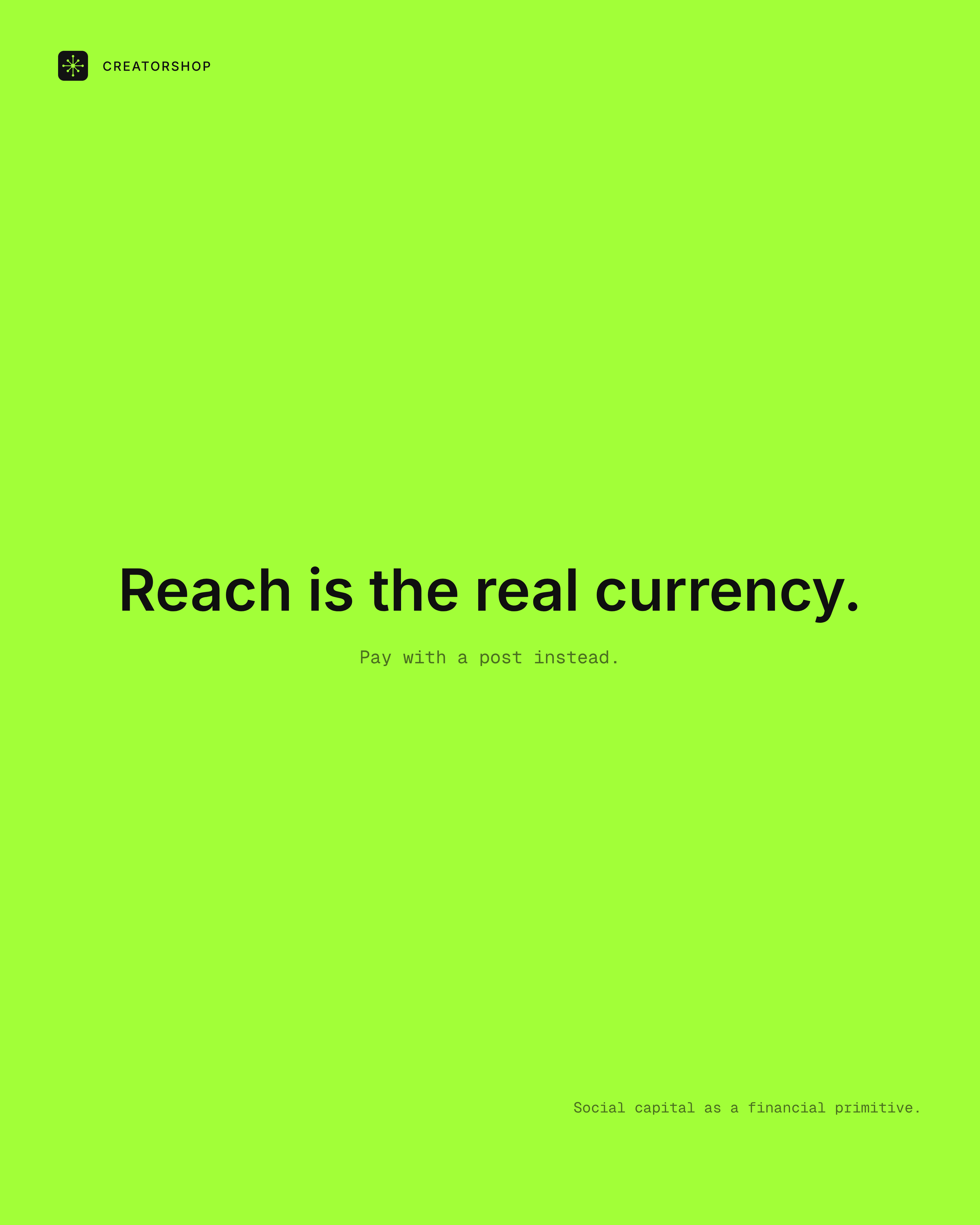
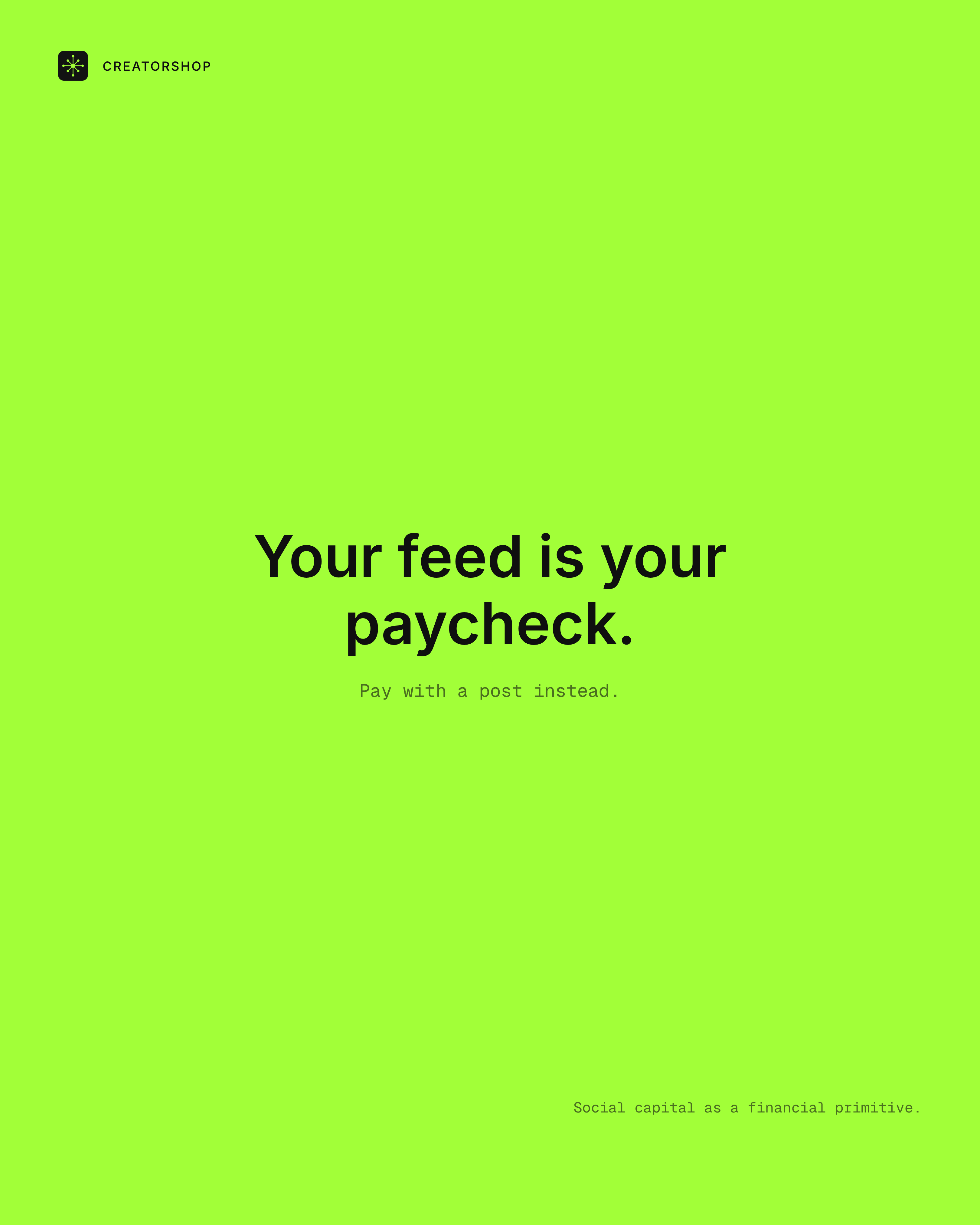
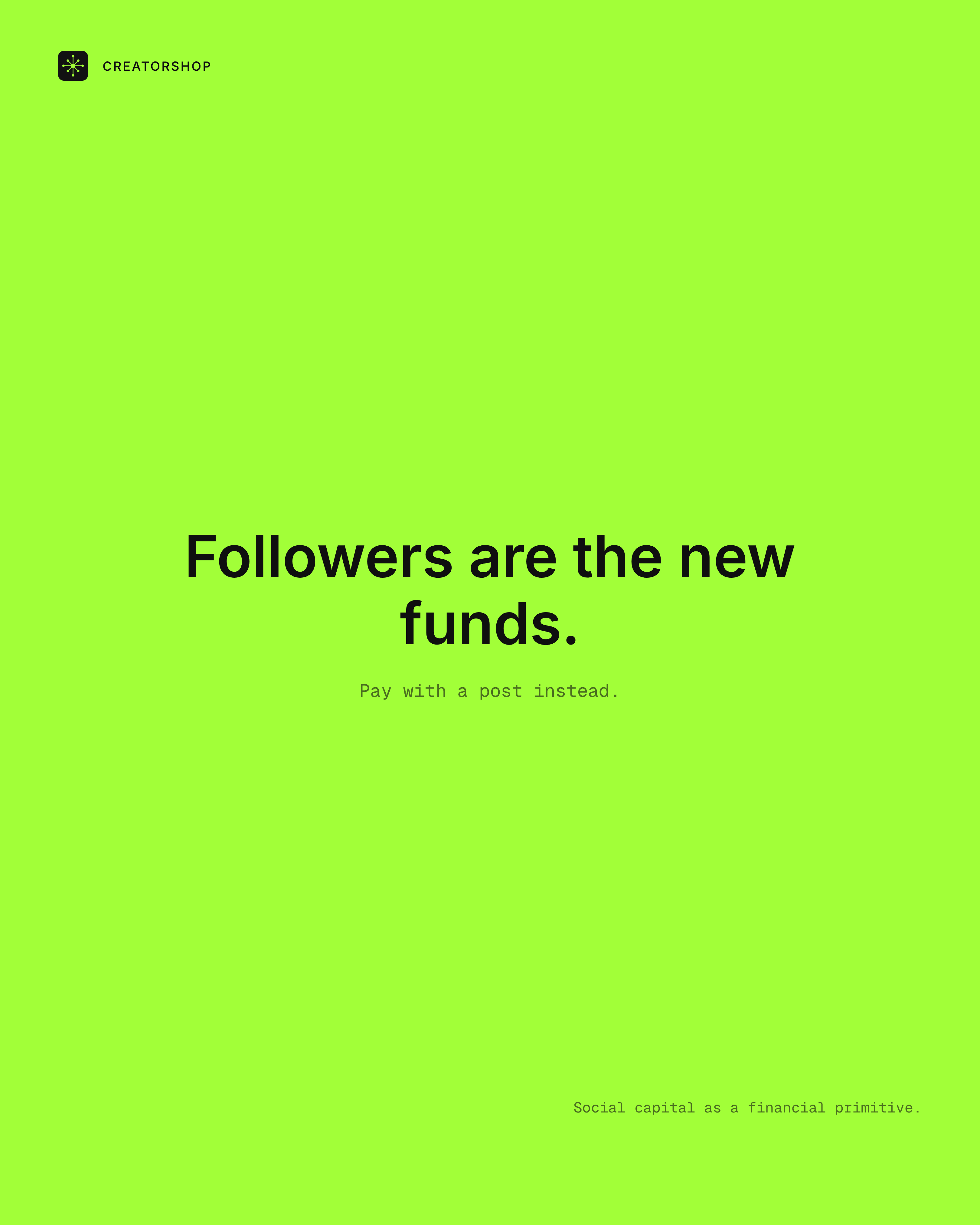
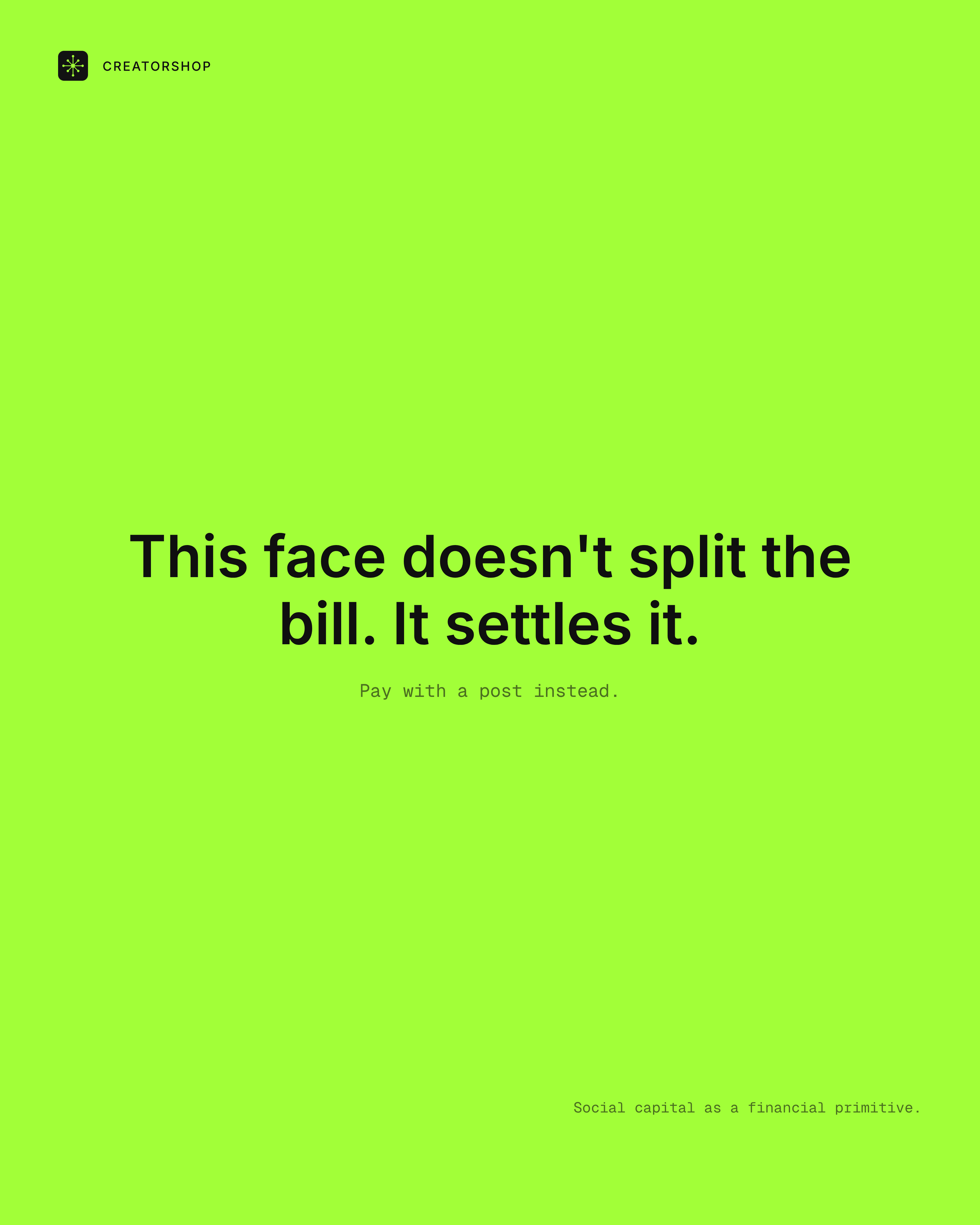
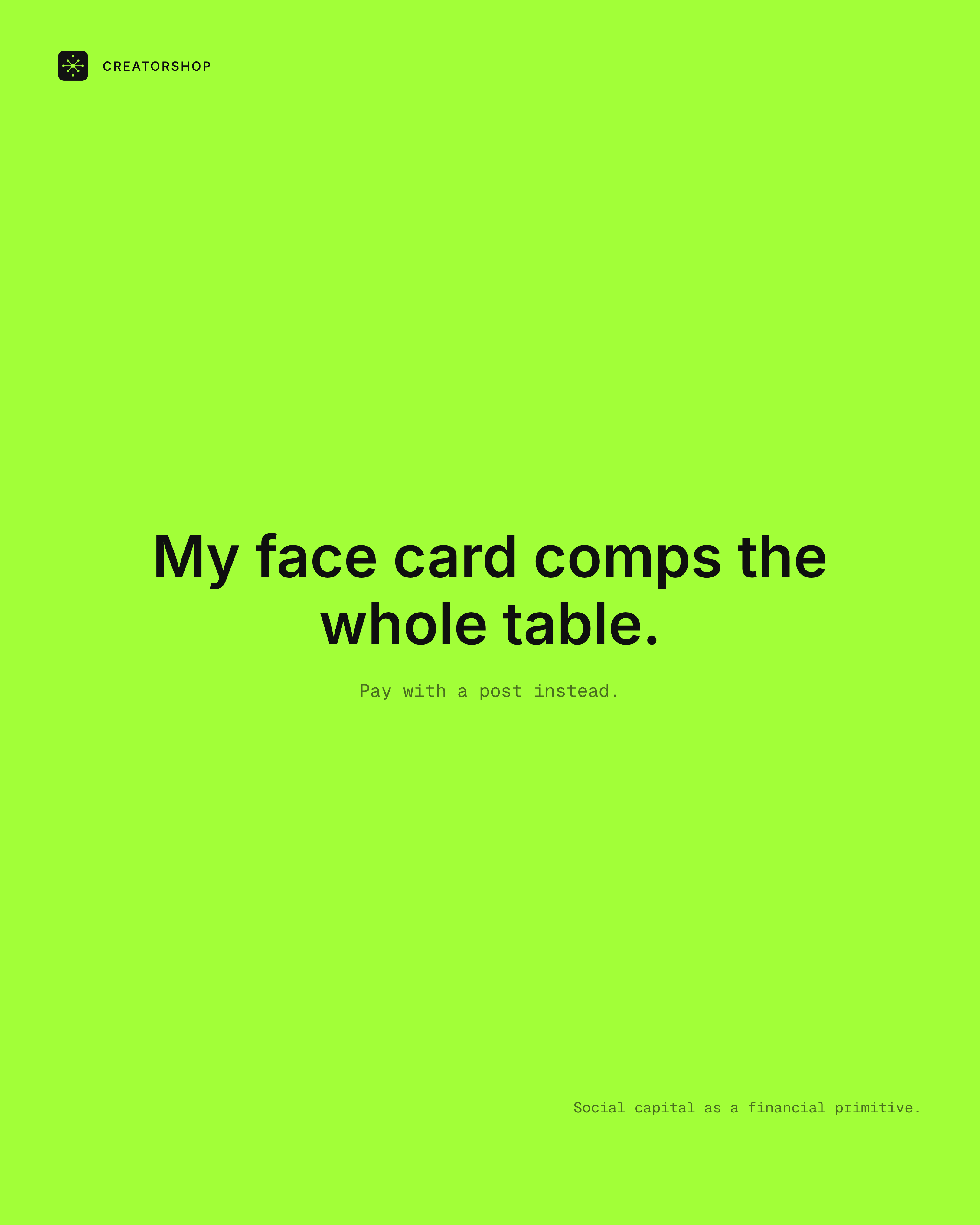
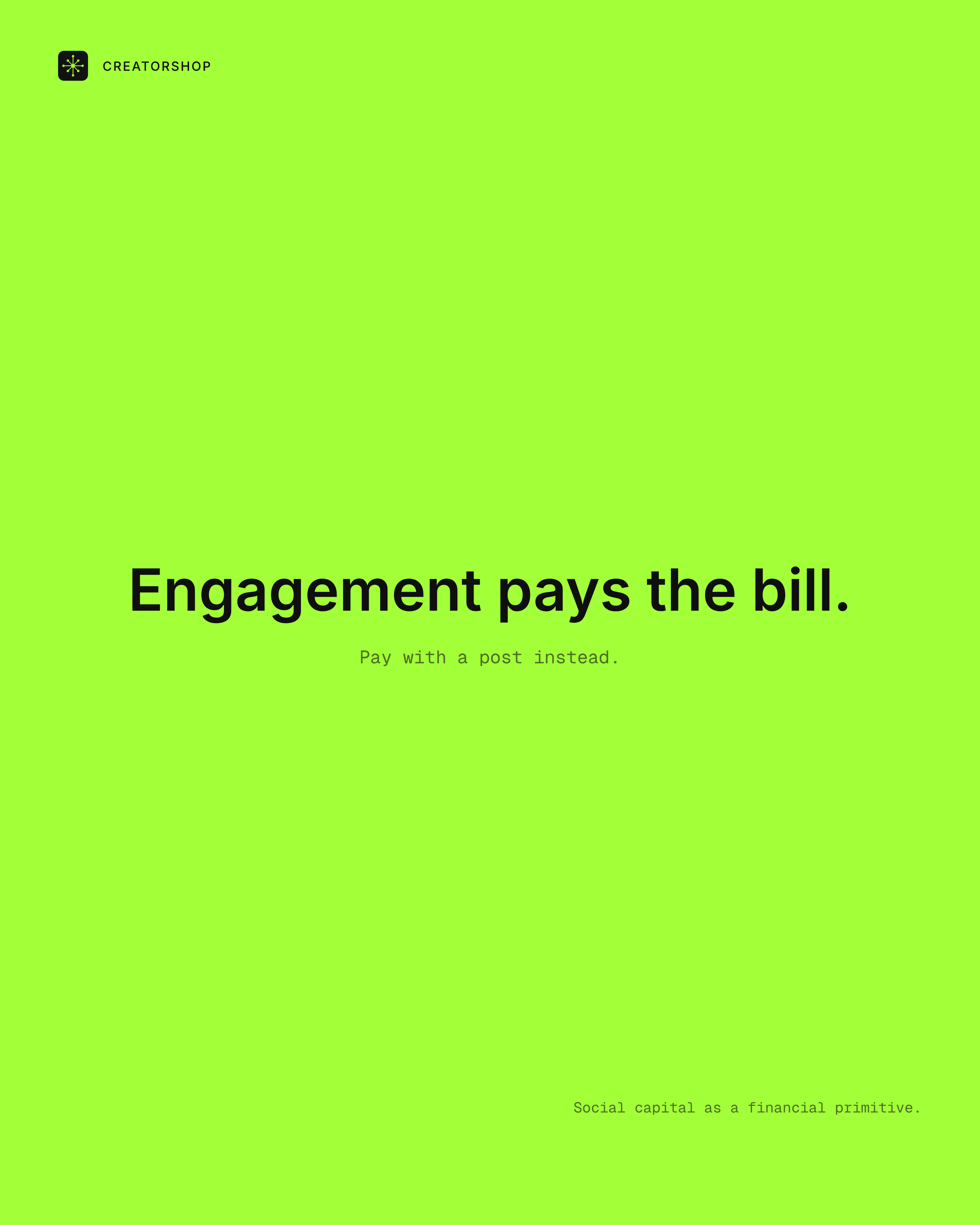
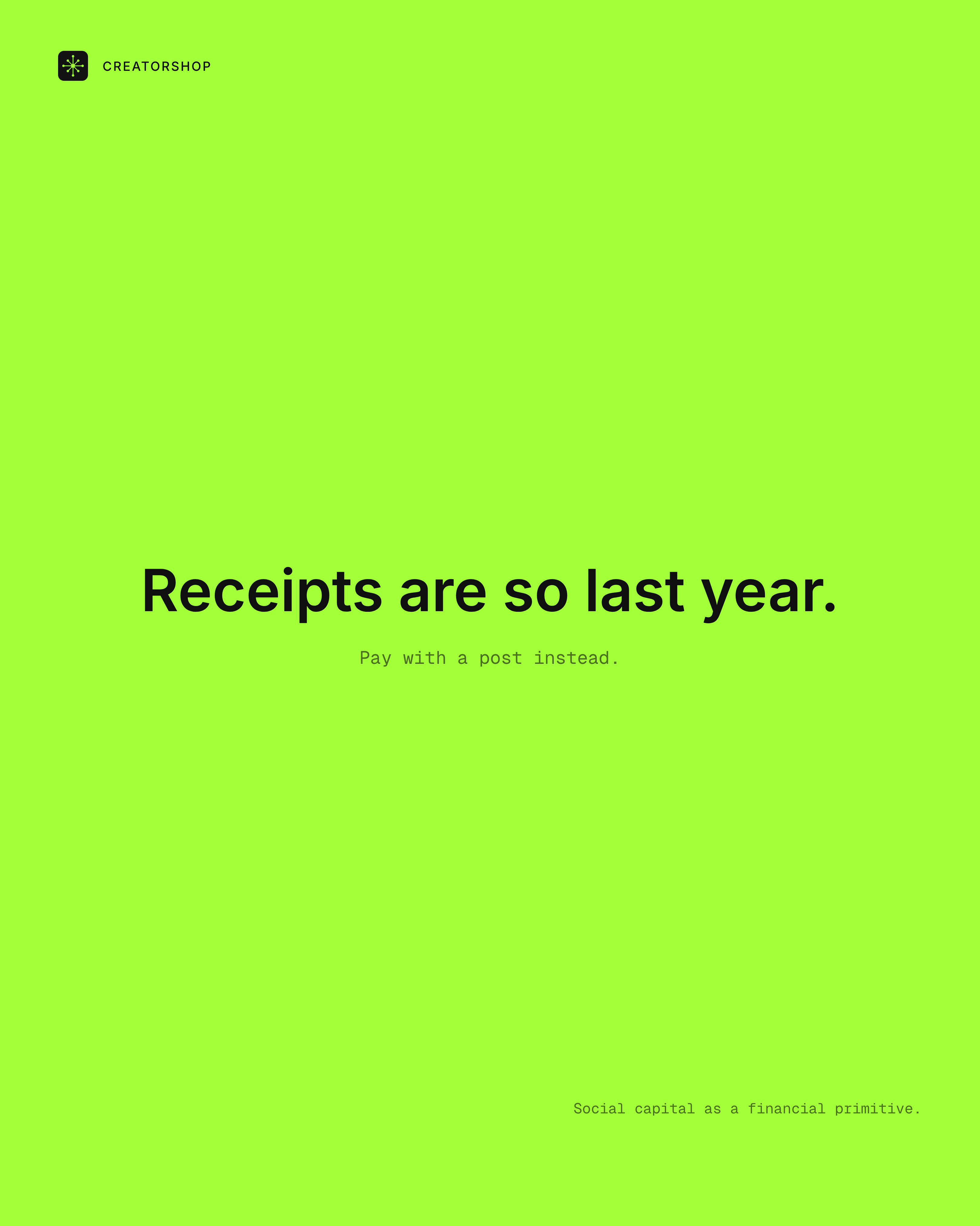
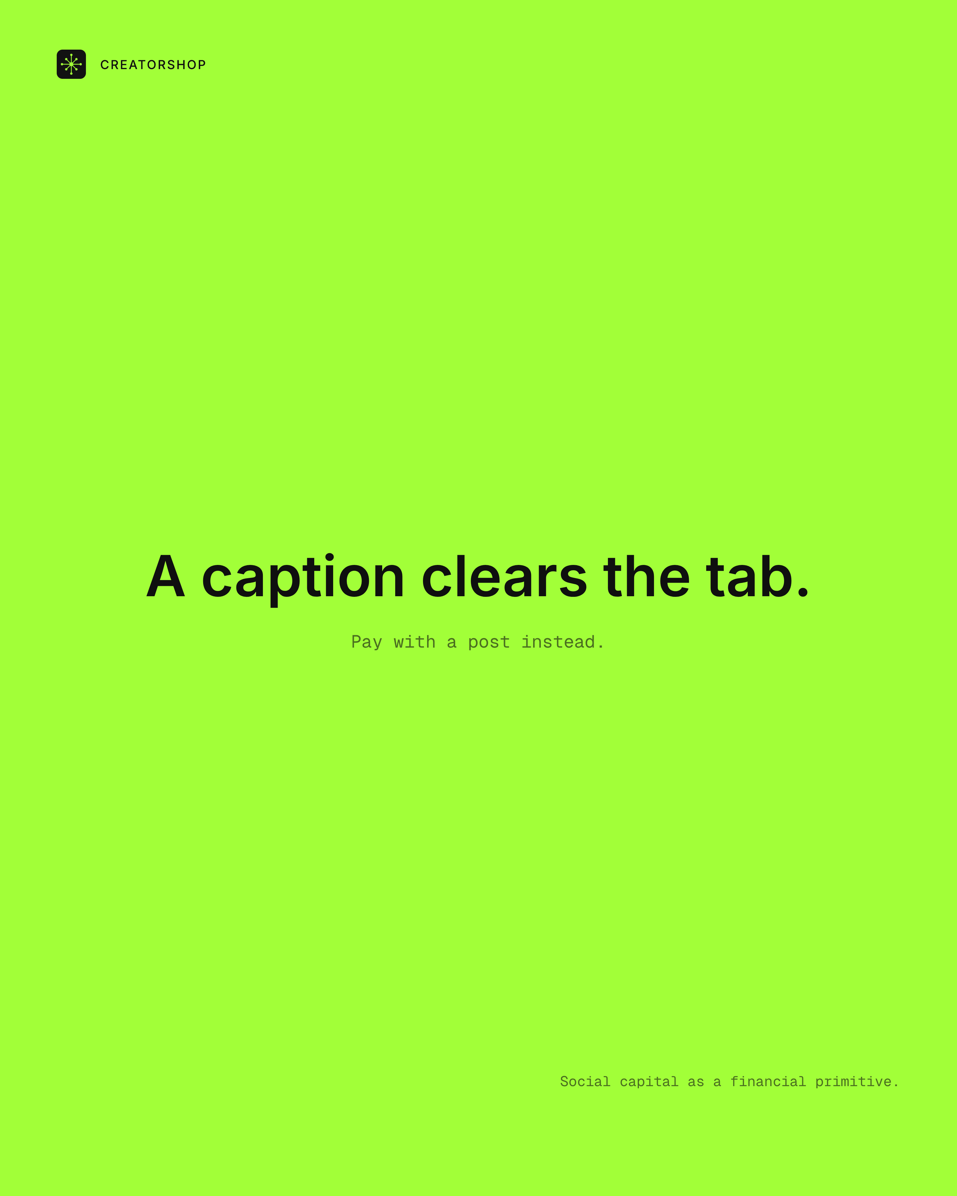
I wanted the UX writing to be incredibly specific for both sides of the marketplace, so I fed Claude some quotes and built a system of throwaway posters generated using Claude Code. It helped me think through how the brand sounds and feels before a single word landed on the page. I wanted the writing to feel internet-native, as far from 'this feels corporate' as linguistically possible, moving as far away from polished SaaS copy as the audience would allow.
Pricing
Highlighting what we want picked.
What Didn't Make the Cut
Not every idea made it. Some cool ideas got cut, not because they failed on their own terms, but because they didn't belong in the visual world being built. A landing page that tries to include everything stops being a landing page.
The New Brand Book: Brand Engineering, the Kit and Internal Tool
I went on to build a brand engineering kit that could help scale the brand, unlike a static brand book. This kit is a Github repo that can be plugged into Claude Code for quick context on how the brand works for generative purposes. Assets like Logos, ASCII Animations, 3D assets, and brand-specific gradients exist in code while having utility across various creative production efforts.
The Build
Both final sites were designed and built by one person using the following stack: Next.js 16 (App Router), React 19, TypeScript, Tailwind CSS 4, Framer Motion, React Three Fiber, drei, three.js, @paper-design/shaders-react, Radix UI, Base UI, Heroicons, Geist with the help of Codex and Claude Code. No handoff. Design decisions could be made, tested in the browser, and iterated the same day.
What's Next
The creator side has a more playful feel and the brand side is more polished while echoing the brand's edge in subtle ways. The next step is putting the two header variants against each other for A/B testing since while I love the more subversive layout we have, I wonder what would convert more. Variant 2 leads with the product mechanic: it's clear and structured, but risks reading as SaaS. Variant 1 is more editorial in feel, with more personality, but risks making the core message harder to land immediately. If the creator-side header leads with desire and feeling rather than mechanics, I'd expect higher scroll depth and stronger waitlist conversion from the creator ICP, so what's next is testing that hypothesis.
Test Setup
- Variant A: editorial entry point, hyper-minimalist restraint and a focus on playfulness and subversion of current layouts as a branding decision and touchpoint.
- Variant B: product mechanic first, what Creatorshop does, with the CTA next, the conventional SaaS layout.
- Success metric: waitlist signups from the creator ICP. Secondary: scroll depth past the hero.
- The test goes live on launch. What we learn will inform not just the page but the web brand positioning going forward.